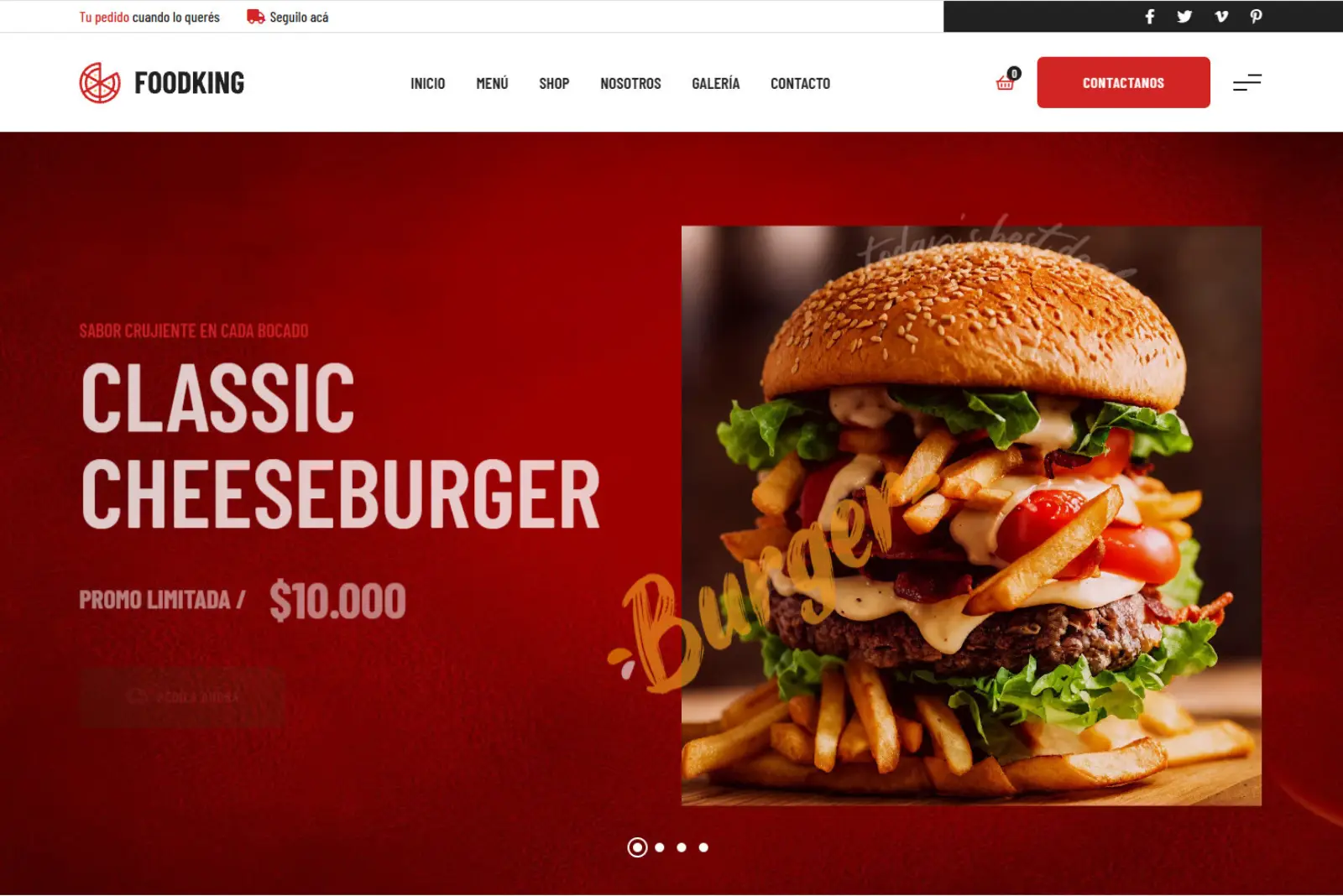
Project Approach
Interactive Digital Menu & Web Platform for Gastronomy
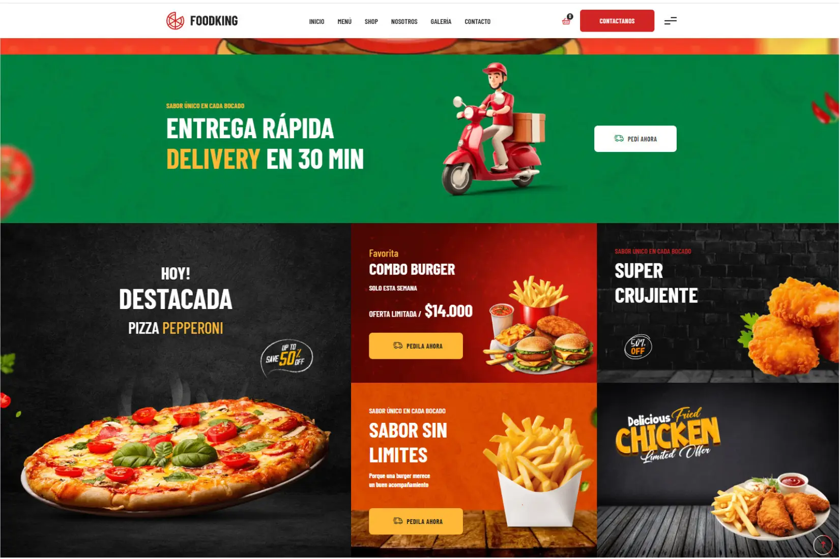
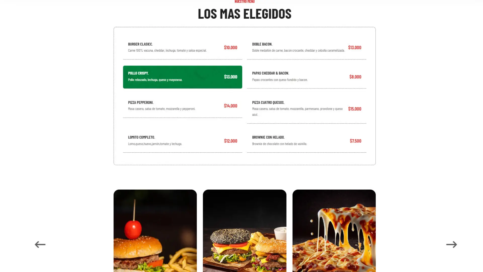
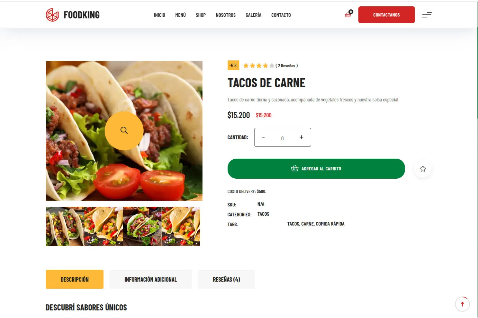
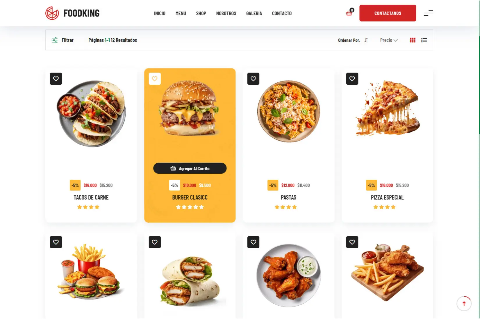
Design and frontend development of a mobile-first web interface tailored for the food and restaurant industry. Engineered to maximize user engagement and conversions, this platform allows customers to seamlessly browse the menu, explore item details via dynamic modals, and navigate product categories fast on any device.
What´s included the Project ?
Key Project Specs
- Role: Web Designer / Frontend Developer
- Tech Stack: HTML5, CSS3, SASS (SCSS), Bootstrap 5, JavaScript / jQuery, Swiper JS, Magnific Popup
- Key Focus: Mobile-First Responsive Design & Fast Performance
Technical Highlights & Value Delivered
- Modular SASS Architecture: Clean, scalable code built with custom variables and mixins.
- Mobile-First UX/UI: Precision-built layout optimized for smartphones, delivering ultra-fast load times and smooth navigation to eliminate ordering friction.
- Interactive UI: Dynamic modal views for inspecting product details without leaving the main catalog.
Website Structure
- Clear navigation
- organized content
- Responsive layout
Menu & Products
- Product presentation
- Menu organization
- Clear information
User Experience
- Intuitive navigation
- Clear calls to action
- Simple ordering flow
Responsive Design
- Desktop optimization
- Mobile adaptation
- Consistent interface
Works
FoodKing Showcase.